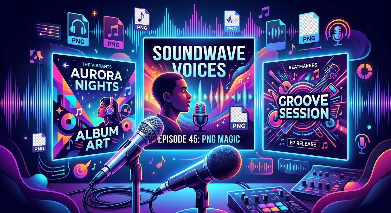
Your cover art is the first thing people see before they press play. Whether it's sitting inside a podcast directory or floating in a music streaming feed, that thumbnail is doing real marketing work. And yet, most independent creators treat it as an afterthought. They slap together an image the night before launch and move on. The result looks rushed, and people can tell.
Key Takeaway: Transparent PNG files are the go-to format for creators who build layered visual assets without a professional designer. They drop cleanly onto any background, mix and match with other elements, and produce polished results in a fraction of the time. Finding trending, ready-to-use PNG graphics built for music and podcast aesthetics means you can skip the from-scratch design process and still look like you hired someone who knows what they are doing.
Why Your Cover Art Matters More Than You Think
Streaming platforms and podcast directories are crowded. Spotify alone hosts over five million podcasts. Apple Music, Bandcamp, SoundCloud, all of it, the visual competition is real.
Album art has been a core part of music culture for decades. Before the digital age, it was a physical object that fans held in their hands. Today it lives in a 3000x3000 pixel box on a screen, but its job is the same: communicate who you are before a single note plays.
Podcasters face a similar challenge. Your cover image shows up in search results, on recommendation carousels, and in listener libraries. A weak image in a strong category drops your click-through rate. A sharp, well-composed image builds credibility before anyone reads your description.
So the question is not whether visual assets matter. The question is how you make them without a designer on retainer.
The Real Reason PNGs Win for Layered Compositions
Not all image formats are built for the same job. JPEGs are efficient and great for photos. GIFs carry animation. But when you are compositing visual elements for a podcast cover or promo graphic, PNG is the clear choice.
The reason comes down to one feature: transparency.
Portable Network Graphics was designed with support for an alpha channel, which is the technical term for pixel-level transparency. That means a PNG can have areas that are completely see-through. Drop a transparent PNG element onto a colored background in any design tool, and the edges blend perfectly. No white boxes. No awkward halos. No visible crop lines.
That is a big deal when you are building layered graphics. Podcast covers often combine a background texture, a portrait or icon, a logo, and some text. If any of those elements come in as JPEGs, you are fighting with hard edges and color artifacts at every step. PNGs slot in cleanly, no matter what sits underneath.
There is also the quality factor. PNG uses lossless compression, so the image does not degrade when you save it. For text and graphic elements with sharp edges, this matters a lot. Compressed JPEG artifacts blur the fine details that make a design look crisp.
What Ready-to-Use Actually Means for Independent Creators
If you are producing your own visual assets, time is the real constraint. You have a podcast to record, edit, and publish. You have tracks to mix and release. Spending three hours designing a single graphic is not a sustainable workflow.
Ready-to-use PNG graphics change that equation. Instead of building every element from scratch, you pull in a graphic that already fits the aesthetic you are going for. You position it, scale it, adjust the color if needed, and you are done. The design decisions have already been made by someone who is good at this.
The key is finding graphics that are actually trending and relevant to your genre or show style. A heavy metal podcast does not want the same visual language as a meditation series. A lo-fi producer is not pulling from the same palette as a pop artist.
That is where browsing by popularity helps. Trending graphics reflect what is resonating with audiences right now, not two years ago. For PNG art that matches current music and podcast aesthetics, starting with a curated popular page means you are not wading through thousands of irrelevant options.
Building a Cover Art Workflow Without a Designer
Here is how independent creators can build a repeatable graphic workflow using transparent PNGs:
- Start with your background, a solid color, gradient, or photo texture that fits your brand
- Layer in PNG elements one at a time, adjusting scale and position before committing
- Keep a small library of your favorite recurring assets so you do not start from zero each time
- Export at the highest resolution your platform accepts, usually 3000x3000 for music and 1400x1400 minimum for podcasts
- Test how the final image reads at thumbnail size, around 150 pixels, before publishing
This process works in Canva, Photoshop, GIMP, Affinity Designer, or any design tool that supports layers. The transparent PNG is format-agnostic. It goes wherever you take it.
The Right Aesthetics for Music and Podcast Covers
Visual style in audio content has its own language. There are genre conventions that listeners recognize immediately, and breaking them without intention can confuse your audience before they even hear a second of your content.
For music, album cover trends tend to track with the era: grainy film textures, abstract geometry, brutalist typography, surrealist photography. Knowing what is trending in your genre lets you position your work accurately on the shelf without copying anyone directly.
Podcast covers have different conventions. Interview shows often lead with faces. Educational shows lean on clean icons and bold type. True crime aesthetic lives in dark palettes and distressed textures. Comedy podcasts tend toward bright, high-contrast designs with strong character work.
The smart move is to pull graphic elements that already speak the visual language of your category, then combine them into something that feels distinctly yours.
Your Graphics Do Not Have to Start From Nothing
The myth that good design requires starting with a blank canvas is exactly that, a myth. Professional designers work from reference constantly. Stock assets, inspiration boards, mood boards, all of it feeds into finished work. The difference between using a resource and plagiarizing is in how you adapt and combine what you find.
Independent creators can do the same thing. The goal is to produce visual assets that represent your work honestly and attractively. If a well-designed PNG element gets you 80 percent of the way there in ten minutes, that is a smarter use of your time than spending an afternoon trying to recreate something from scratch.
What you are building is a visual identity that shows up consistently across your cover art, social thumbnails, and promotional graphics. Consistency matters more than complexity. A simple, well-executed cover that uses the same palette and style across every touchpoint will outperform an elaborate design that looks different every week.
Where Transparent PNG Graphics Fit in Your Broader Workflow
Cover art is one piece of the puzzle. Independent creators also need social thumbnails for YouTube, square graphics for Instagram, horizontal banners for SoundCloud and podcast platforms, and promotional assets for email and newsletters.
Transparent PNG elements scale across all of these. The same graphic that sits on your podcast cover can anchor an Instagram post. The same logo treatment that appears on your album art can carry into your promotional banner. When your core visual elements are clean, transparent PNGs, remixing them across formats takes minutes, not hours.
This is where investing a bit of upfront effort in your asset library pays off long term. A folder of 50 to 100 quality PNG elements that fit your aesthetic becomes a toolkit you reach for every release cycle. The longer you build it, the faster each new graphic comes together.
Making the Time Investment Pay Off
The time you spend getting your visual assets right pays dividends for months. A podcast cover runs for an entire season. An album cover lives for the life of the record. These are not throwaway graphics.
The smart approach is to invest time upfront finding graphics that genuinely fit your aesthetic, then build a small personal library of elements you can reuse. PNG files are small enough that a folder of several hundred elements takes up almost no storage space.
Start with what is popular. See what is resonating. Adapt it to your context. The goal is not to use a trending graphic unchanged but to understand the visual vocabulary that is working right now and bring that energy into something that represents you.
PNG Graphics Are the Practical Choice for Serious Independent Creators
If you are producing audio content without a dedicated designer, transparent PNGs are the tool that makes professional-looking visuals achievable. They layer cleanly, compress without degrading, and transfer across formats without friction. Knowing how to use them well is one of those skills that quietly separates creators who look established from those who look like they are still figuring it out.
Finding the right graphics does not have to be a research project. Browsing by what is currently popular gets you to relevant, trending options without sorting through thousands of mismatches. Your listeners will notice the difference in your visual presence, even if they could not tell you exactly why.