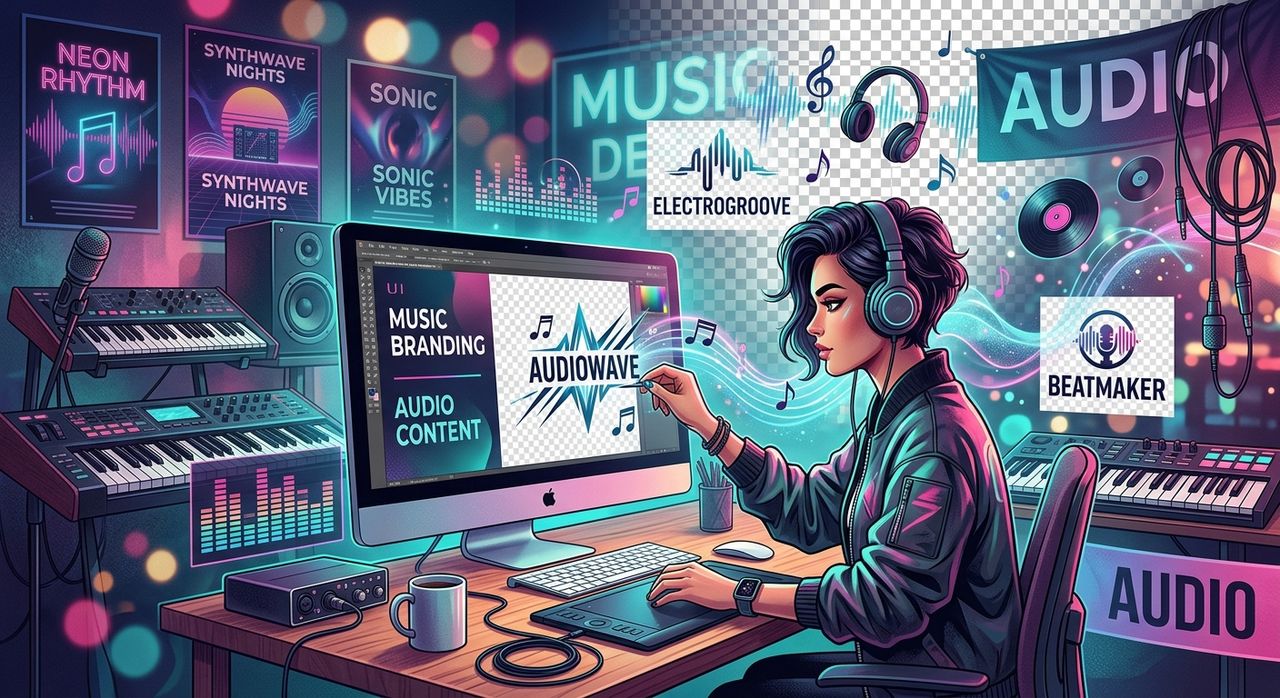
Your audio brand is more than a sound. It is a look, a feeling, a visual signature that listeners recognize before they even press play. Whether you run a music podcast, produce beats, host a DJ livestream, or release original tracks, the visuals you choose define how people perceive your work. Transparent PNGs are one of the most versatile tools in that visual toolkit, but most creators use them as a scattershot afterthought rather than a strategic asset. This article is about doing it the right way.
Your visuals are your brand's first impression. Consistent, intentional use of transparent PNGs across your audio content creates a recognizable identity that builds trust with your audience.
- Choosing a visual theme that matches your show's tone is the foundation of good branding
- PNG files with transparent backgrounds layer seamlessly across any platform or template
- Drilling down from broad themes into specific visual categories ensures cohesion, not chaos
Why Audio Brands Need a Visual System, Not Just Images
A lot of creators treat graphic assets like grocery shopping. They grab what looks good in the moment, use it once, and move on. The result is a social feed, a YouTube channel, or a Spotify canvas that feels disjointed. Listeners pick up on that inconsistency even if they cannot name it.
Brand identity is the set of visual elements that communicate who you are and what you stand for. For audio brands, this includes the fonts you use, your color palette, your logo style, and the imagery you reach for repeatedly. Transparent PNGs play a specific role here because they are infinitely stackable. You can drop them onto any background, in any color environment, without worrying about white boxes or mismatched edges.
The goal is not to find one great image. The goal is to build a repeatable visual vocabulary that you can use across dozens of pieces of content without starting from scratch each time.
Start With Theme, Not With a Search Bar
Most people open an image site and immediately type something hyper-specific. "Electric guitar silhouette." "Headphones blue." That habit skips the most important step: figuring out what emotional territory your brand actually lives in.
Before you search for anything, ask yourself a few questions.
- What is the core mood of your content? Is it energetic and loud, or contemplative and slow-burn?
- What visual world does your audience already inhabit? Hip-hop aesthetics look very different from ambient electronic or country music branding.
- What colors define your brand? Warm tones, cool tones, monochrome, or something maximalist?
- Do you lean toward photography-style realism or illustrated, graphic art?
- What do you want listeners to feel before they hear a single second of your audio?
These answers should guide every visual decision you make. Once you know the emotional palette you are working from, you can start browsing by theme rather than by individual asset. Browsing PNG collections organized around broad themes like music, nature, abstract art, or neon aesthetics lets you assess whether a visual territory feels right for your brand as a whole, not just whether a single image looks cool in isolation.
Building Your Visual Vocabulary
Once you have identified your brand's general visual theme, you need to populate that theme with repeatable elements. Think of it like building a wardrobe. You do not want thirty one-off pieces that do not work together. You want a core set of items that can be combined in different ways.
For audio brands, that visual wardrobe often includes:
- A primary icon or logo mark (your podcast artwork, your artist logo)
- A secondary set of decorative elements that reinforce the mood (sound waves, musical notes, abstract shapes)
- Category-specific imagery tied to your genre or format (instrument graphics, stage and concert imagery, studio equipment visuals)
- Atmospheric textures or overlays that go behind other elements (grunge, grain, glow effects)
Each of these works best as a transparent PNG because you need to layer them. Your primary icon sits over a background. Your decorative elements frame a social post. Your category imagery fills a header or thumbnail while text sits cleanly in front of it.
From Theme to Specific Style: Narrowing Your Category
There is a difference between knowing you want a "music and performance" aesthetic and knowing exactly which type of music imagery fits your specific show. A jazz podcast has very different visual needs than a metal production channel. A lo-fi beats creator is working in a completely different design space than a concert photographer turned audio blogger.
This is where narrowing from theme to category matters. After you have a sense of the broad visual territory that fits your brand, browsing PNG categories lets you drill into specific visual styles. You might decide that instrument graphics, particularly string and woodwind images, match the acoustic warmth of your content. Or you might find that concert crowd imagery and stage lighting effects align better with your high-energy live music coverage.
Getting specific at this stage prevents a common branding mistake: collecting assets from too many different aesthetic worlds. If your cover art uses vintage instrument illustrations but your social posts use neon rave photography, the brand feels like two different shows. Narrowing your category selection keeps everything pulling in the same direction.
How to Apply PNGs Consistently Across Platforms
The Portable Network Graphics format was specifically designed to handle lossless compression and transparency, making it the ideal file format for layered design work across different platforms. The same PNG asset can go into a Canva template, a Photoshop file, a video editor timeline, or a streaming platform's press kit without losing quality or picking up ugly white borders.
Here is a practical system for keeping your visuals consistent:
- Create a master asset folder. Store your approved PNGs in one place, organized by type: icons, decorative elements, category imagery.
- Set a limited palette. Pick two or three PNG themes and stick with them. More variety feels chaotic to viewers.
- Resize proportionally, not asymmetrically. PNG files scale well, but distorting proportions will make your brand look amateurish.
- Use the same assets across platforms. If a concert graphic appears on your episode thumbnail, use a version of it on your Instagram story too.
- Review your visual output monthly. Check that your recent posts, thumbnails, and headers still feel cohesive.
The Practical Difference Between Consistency and Repetition
Some creators worry that using the same PNG assets repeatedly will make their content feel repetitive. It will not, because consistency and repetition are different things.
Repetition means using the exact same image in the exact same way across every piece of content. That is lazy and forgettable. Consistency means using assets from the same visual family in varied compositions, different color treatments, or different layouts while keeping the overall feeling unified.
You can use the same guitar silhouette PNG in fifty different thumbnails and have each one look fresh if you are changing the background color, the layout, the supporting text treatment, or the secondary elements around it. The guitar becomes a signature, not a stamp.
This is why building a visual vocabulary matters more than hunting for perfect one-off assets. The vocabulary is what you draw from repeatedly, in different combinations, to create work that feels both fresh and familiar.
Your Brand Sounds Good. Now Make It Look That Way.
Audio brands have spent years perfecting how they sound. The production quality is there. The editing is tight. The music is genuine. But the visual layer often lags behind, and that gap costs creators audience growth they have already earned through their audio work.
Transparent PNGs, used with a clear visual strategy, close that gap without requiring design expertise or a big budget. The work is in the thinking: defining your brand's tone, choosing a theme that matches it, narrowing into a specific visual category, and then applying those assets consistently across every platform where your audience finds you.
Pick your theme. Build your vocabulary. Show up with visuals that sound like you.